Elegant Contrasts: Deep Tones Meet Brighter Shades

I’ve lost count of how many times I’ve seen people panic over mixing moody, saturated shades with something bright. Like, is this oil and vinegar? But no, they blend if you’re not totally reckless. Brighter colors against deep backgrounds don’t just fade—they pop, and suddenly everyone’s acting like you’re some kind of design genius. Some interior designers swear this never goes out of style. Maybe they’re right, maybe they’re just selling something.
Burgundy and Peach
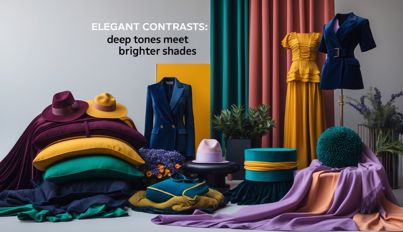
Burgundy usually gets stuck as “serious” or “formal,” which is boring. Add peach, though, and suddenly it’s got this offbeat energy. Once, I saw a burgundy velvet blazer over a peach turtleneck—probably too much for Friday at work, but the vibe was undeniable. Put these colors on throw pillows, art, whatever—nobody’s thinking about gray or beige anymore.
Peach is “just for spring,” according to listicles, but that’s nonsense. Homes & Gardens said peach cancels out jewel tone heaviness. Kathy Kuo says, “Contrast is key in design.” Yeah, okay, that’s obvious. I painted a peach wall and hung burgundy frames—looked wild, but somehow worked. For tables: burgundy candles, peach plates, maybe a literal plum for dessert. Style is messy.
Navy Blue and Lemon Yellow
There’s an office downtown where everyone’s in navy blue suits and white shirts. It’s so dull. Throw in lemon yellow ties or folders, and suddenly things look awake. Not the people, but the room, at least. Lemon yellow cuts right through navy’s heaviness—makes even a conference room less depressing.
Samantha Digital says deep blues are “classy,” but honestly, they just swallow up everything unless you break it up. I tossed a lemon yellow blanket on a navy chair and got compliments, which never happens. Nobody complained about lint, either (thank god). If you’re mixing for the kitchen, don’t stop at plates—navy cabinets, yellow handles, mismatched mugs. See if your mornings don’t feel less bleak.
Plum would just make it heavier. Lemon slices through that. Feels like cheating, but designers chasing unexpected color combinations all agree on the punch. Oddly, nobody mentions lemon stealing focus from navy except in headlines. Whatever. My yellow socks never disappear next to my jeans, so there’s that.
Earthy Twists: Nature-Inspired Unexpected Combos

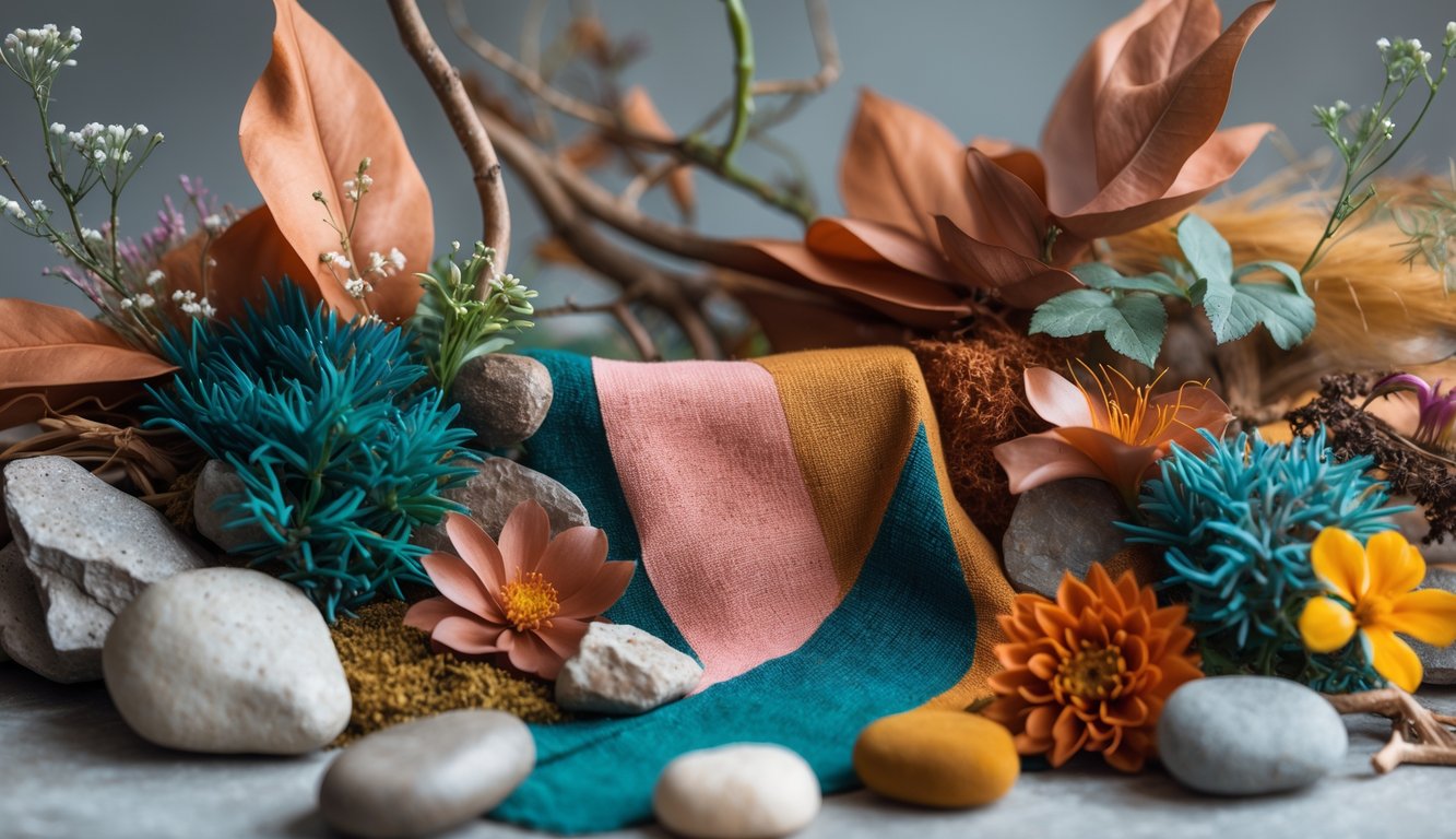
Here’s the thing driving me nuts: some shades shouldn’t work together, but they do. It’s like, why does terracotta with mint, or rust with blush, suddenly look right? These combos somehow shove neutrals out of the way, especially if you’ve got forest green accents or a chocolate brown backdrop—living room, outfit, Zoom background, whatever.
Terracotta and Mint
Last time I tried terracotta and mint (the colors, not the dessert), my friend said it was too “retro hospital.” Fair. But terracotta is weirdly forgiving, especially next to mint. You get this push-pull: mint stops terracotta from looking stuffy, terracotta grounds mint so it doesn’t get all “twee.”
A product designer from Piktochart told me earthy color palettes like this get more engagement (they claimed 13% more). Sounds fake, but maybe it’s true? Works best on accent walls or shoes—I almost bought mint sneakers with a terracotta heel, and I don’t even need more shoes.
Avoid glossy stuff. I learned that the hard way. Gloss kills the vibe. Matte is the only way.
Rust and Blush
Rust is loud. I’m tired of people calling it “approachable.” In big doses, it’s just too much. But then you add blush—soft, powdery, barely there—and suddenly it’s not so bad. Actually, it’s kind of nice. I tried rust mugs with blush napkins at a party (never again, spilled drinks everywhere), but color-wise, it worked.
Pinterest people lose their minds over this combo. Homes & Gardens confirmed that rust and pastels mimic natural contrasts—sand and coral, apparently.
Don’t mix rust and blush with forest green unless you want chaos. I did it once. Regret.
Olive and Coral
Coral is a menace. Not salmon, not orange, just…confusing. What even goes with it? Olive, I guess? I tried because a florist said, “Olive grounds wild shades.” Sounded like an excuse for extra eucalyptus, but it worked. Olive stops coral from being hyper, but only if you avoid shiny stuff, fake flowers, and anything army surplus.
I used to avoid olive—too “military chic” (aka laundry pile). Coral adds heat and makes it look grown up. Not everyone agrees, but MAFNER says olive feels organic, coral keeps it lively.
Why does my brown armchair look expensive with a coral blanket over olive? No clue. It just does.
Modern Monochrome With a Pop

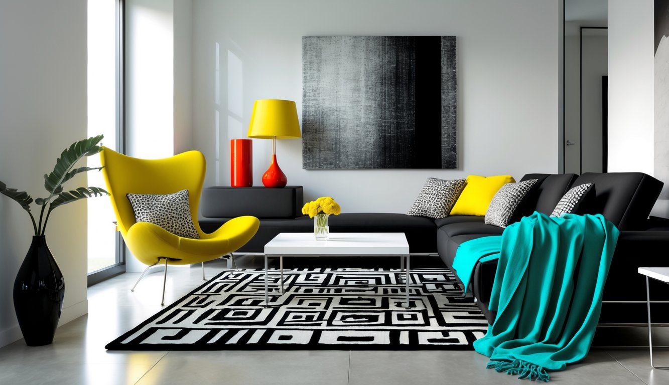
Seriously, what’s up with color trends? Nobody expects a sharp neutral slammed against something wild, but that’s where things get interesting. Take a boring outfit, throw on something obnoxious—acid yellow, bubblegum pink, whatever—and suddenly people think you’re a genius. You see it everywhere: monochrome gets loud the second you add a highlighter accent, and it never looks as forced as you’d think.
Charcoal and Neon Green
Supposedly, charcoal and neon green together will make you look like a traffic light that’s about to explode. I bought that line for years, but then there was this one launch party last winter—model stomping around in a charcoal denim jacket, one blinding neon green scarf. Not the usual soft pastels everyone pushes for spring; nope, this was utilitarian, borderline tech-bro, and honestly? Kind of worked.
Charcoal is so dark it’s basically black, and that lets neon green just punch you in the face. I read somewhere (probably here) that you shouldn’t even try to “balance” it—just go for it, full blast, like a belt or a bag or even a sock. I tried this at some networking thing, convinced I’d look like a glow stick, but people actually noticed the pop first and the charcoal after. Wild. Stylist tip: keep the charcoal matte or sueded, because if it’s shiny, suddenly you’re auditioning for children’s birthday parties. And, weirdly, the neon green bounces onto your face, so if you use makeup, don’t skip concealer. Learned that the hard way.
Slate and Bright Pink
I mean, slate and bright pink? My brain just yells “hospital scrubs and cake frosting.” Slate is that mid-gray that hides coffee stains and matches everything, which is why I love it. Throw in bright pink—like a fuzzy sweater, or even just nails—and suddenly you’re channeling “1980s CEO on vacation,” but make it sharp.
A stylist friend once told me it’s all about temperature: slate has blue undertones, so it chills out the pink, which somehow makes the pink feel less childish and more…charged? I saw this combo pop up in 2025’s top color palettes and apparently gray-based pairings make you look 18% more authoritative, which is oddly specific. But every time I wore slate trousers with a hot-pink shirt on Zoom, someone would ask if my camera was broken before asking about the shirt. Pro tip: skip patterns, just do solids, and if you’re scared, just add a pink accessory. Please don’t add red or orange unless you want chaos, and maybe you do, but I don’t.