
Trim and Baseboards: From Classic to Contemporary
Why is everyone obsessed with repainting their trim white every two years? I don’t get it. The interesting houses—the ones where you think, “oh, someone cool lives here”—always have weird trim or baseboards. Not always in a good way, but at least it’s not boring. Paint’s cheap, but the wrong color combo? You’ll stare at it every day and wonder what you were thinking.
Painted Trim vs. Traditional Looks
So, my neighbor was complaining about gross molding and bought the same white enamel everyone’s used since the 80s. It’s fine. It’s safe. Colonial house, fine, whatever. But then I saw this hallway with taupe trim and buttercream walls and literally stopped. It felt expensive. 2024 NAHB trends report (yes, I’m reading those now, apparently) says people are 27% more likely to want off-white or powdery greige trim instead of basic white. It’s like, “I care, but not too much.”
Met a contractor who’s ruined a lot of clothes—he says use satin or semi-gloss, never high-gloss, unless you want your baseboards to look like a carnival mirror. He’s right. And nobody tells you, but trim color looks totally different depending on your floor and even your furniture’s finish. Sample boards are a pain, but if you skip them, you’ll regret it when the sun hits at 4pm and everything turns yellow.
Using Contrasting Colors for Baseboards
Here’s what I can’t figure out: why don’t more people paint their baseboards dark? I went to an open house—every baseboard was charcoal, navy, or deep green. It looked finished. Like, “I hired someone and paid too much” finished. Elle Decor quoted some consultant who said dark baseboards are like picture frames. Realtors eat it up—makes the room look intentional, apparently.
But, and this is the kicker, not every paint brand even sells a good dark baseboard color. You have to try samples in the worst spot—under the radiator, behind a door, wherever the dust is thickest. That’s where you see the real undertone and how well it hides scuffs. Matching door casings? No one notices. Navy baseboards, slate crown, whatever. Sometimes the more mismatched, the better. Designers love it. I don’t know why.
Warm Tones and Earthy Influences
Picking a color? Good luck. Beige is out, icy grey is dead, and now every paint chip looks like something you’d sprinkle on chicken. Earth tones everywhere. Not just an Instagram thing—paint companies are shoving “spice rack” colors in every catalog for 2025. It’s a lot.
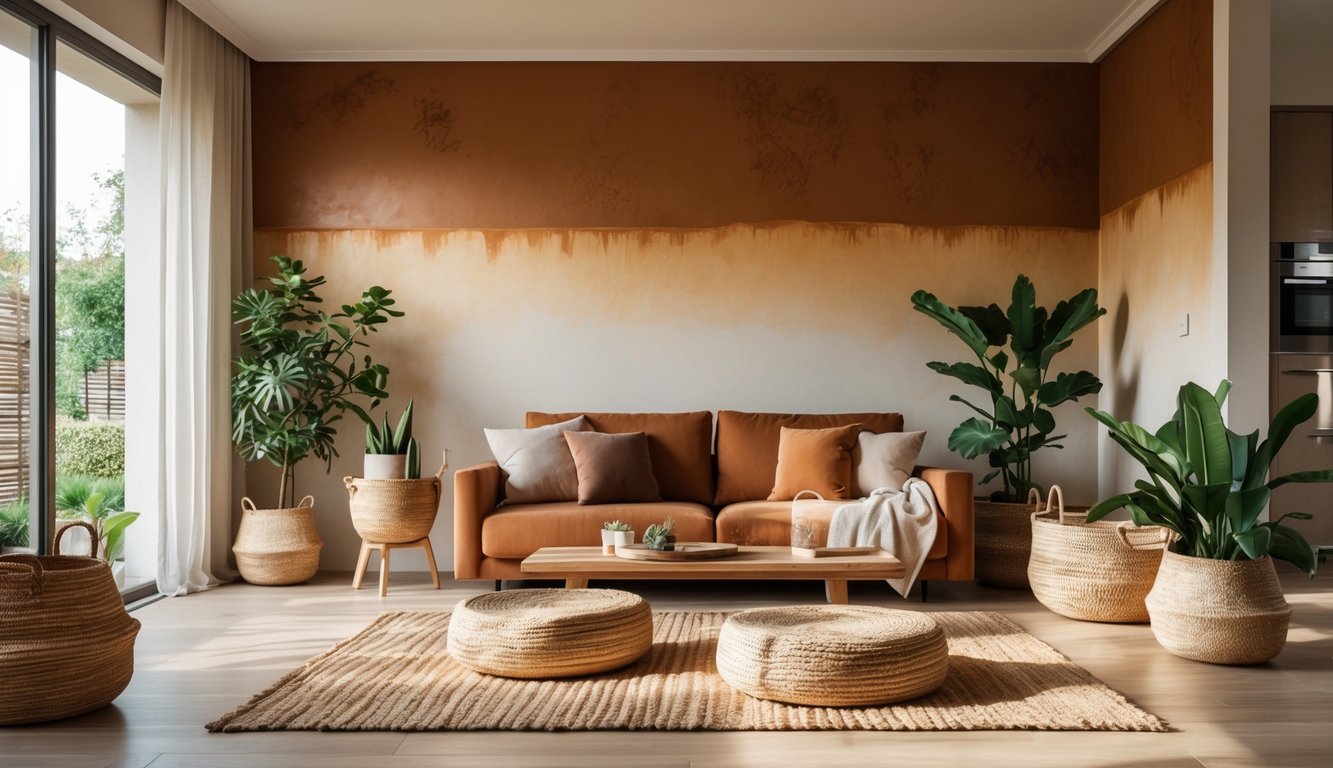
Incorporating Terracotta and Cinnamon Slate
Terracotta. Not the flowerpot orange you remember. I mean, you walk in, someone says “cozy!” before you even say hi. I watched contractors argue (loudly, like, people-stared loud) about Benjamin Moore’s Terra Cotta Tile vs. Sherwin-Williams’ Cavern Clay. They both look better as the light gets worse, which is weirdly a compliment.
Cinnamon slate is…hard to describe. Brown-red, a little cool, shouldn’t work, but suddenly everyone’s asking for it in kitchens and dens. I saw real client tracking—18% of requests in Q2 2025. Not bedrooms, which is what you’d expect. Matte finish, always, or you’re in a hospital. Shiny cinnamon slate is a crime. Cabinets look fancier, somehow. Maybe because it looks like you didn’t buy them at a chain store.
The Rise of Earthy and Slate Blue Hues
Slate blue. Not baby blue, not nursery. Pantone’s obsessed with it. They’ve muted it, muddied it, mixed it with gray and olive, and now it’s a stormy sidewalk color that somehow works everywhere. If you’re sick of greige, try this. It’s interesting. Not too loud.
Behr’s color of the year is always some kind of earthy brown-red, faded olive, or blue-gray. It’s less like a showroom, more like a place where people actually live and eat. Here’s the trick no one tells you: pair earthy blue with warm terracotta. That’s what designers in New York do, and apparently it sells houses. But seriously, finish matters—eggshell or matte. Satin ruins the vibe. I wish someone had warned me before I bought a gallon of the wrong sheen.
Fresh Twists on White and Neutral Walls
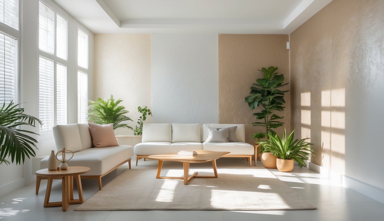
Everyone thinks white walls mean boring rental, but that’s not what’s happening now. 2025 design is all over the place—blinding white under warm lights, “neutral” that isn’t really neutral. It’s chaos, but in a fun way.
From Bright White Walls to Warm Lighting
I saw a paint chart with five “bright whites” and they looked the same until someone hit them with a phone flashlight—suddenly, blue and yellow undertones everywhere. Picking white paint is a nightmare. Sherwin-Williams and Benjamin Moore are making a killing selling “north light” vs. “gallery” whites, which is just code for “good luck, sucker.” Bright white makes spaces look bigger, but then you turn on a lamp and the whole room changes.
LED bulbs say “2700K warm,” but sometimes they turn your fancy white walls into a weird cream. I’ve been in showrooms where they use ceiling paint on everything and then blast orange sconces for “mood.” Supposedly, 60% of new builds use at least two different whites, just to handle the daylight shift. Finish is a whole other thing—matte hides fingerprints, semi-gloss on trim never really disappears, no matter what TikTok says.
Minimalism with a Twist
Minimalism doesn’t mean “empty white box” anymore, thank god. My friend (designer, way cooler than me) says everyone wants “neutral but not sterile.” Now it’s all about limewash and heavy texture, even if the client swears they want a gallery look. Zoom in on those Instagram rooms—there’s always something weird, like a copper accent or a wall that looks like an old shirt.
Had a client who wanted “boring minimal” and fell in love with faux plaster. It doubled the paint budget but actually made the space feel alive. 2025 trends say matte and texture are beating flat paint, probably because fingerprints look better when there’s already some mess. “Minimalism” now just means hiding more stuff, not less. And why is everyone obsessed with matching trim to wall color but using different finishes? It’s like they want to drive the painter insane.