
Bold Color Moves: Breaking Away From the Ordinary
Ever stared at a wall and wondered if navy would just swallow your living room? I told someone to try red ochre trim last year and she texted, “My neighbor gasped. Not joking.” It’s not about being edgy—sometimes bold just looks better. Subtle isn’t always soft. Picking the “wrong” shade can make your house way more interesting.
Navigating Bold and Dark Paint Colors
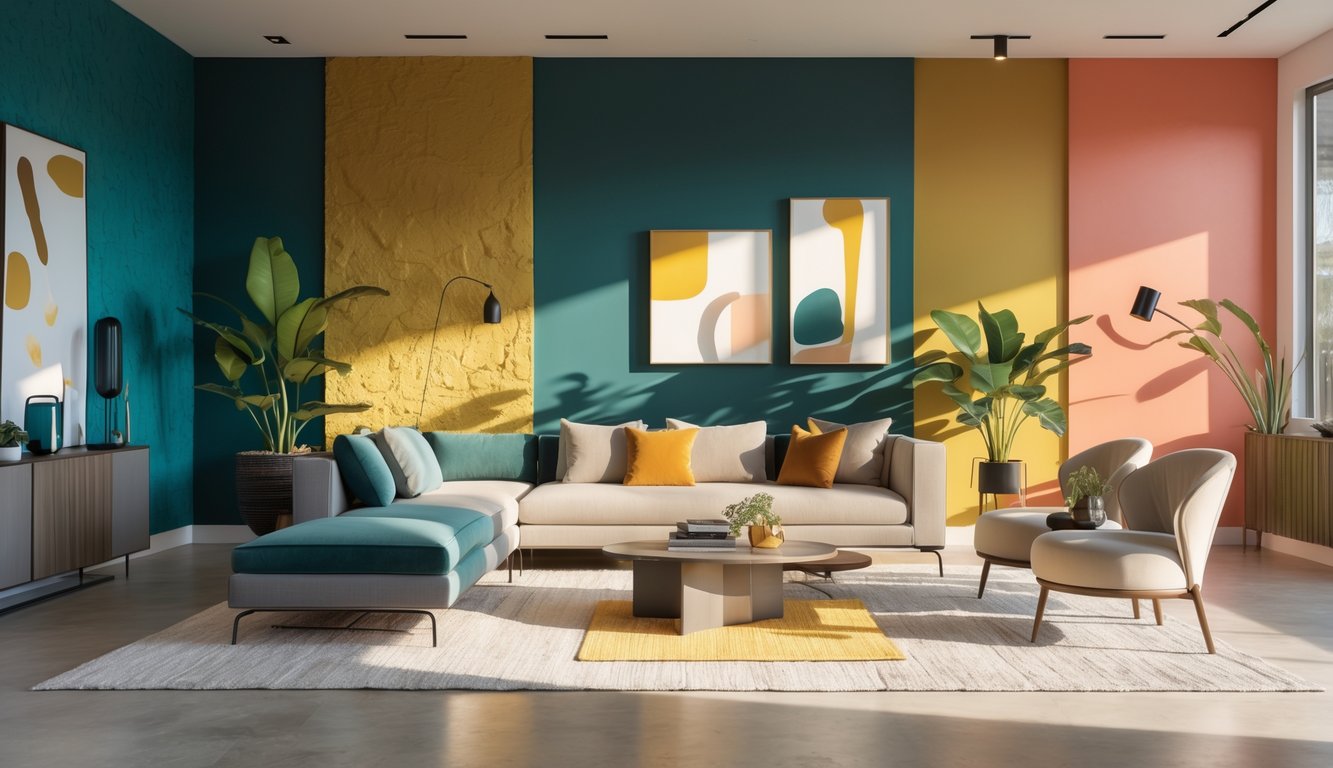
There’s a catch, obviously. Dark colors—Sherwin-Williams Urbane Bronze, for example—show every speck of dust. I learned fast that bold shades need perfect prep: sanding, good primer, crisp edges. Skip that, and the weird streaks will haunt you at sunset. Flashy colors don’t have to be tacky. Color blocking with soft terracotta, electric lime trim, or deep purple and mustard? Designers are into saturated, not neon. Benjamin Moore says 34% more people are painting whole rooms with “statement” colors. Wild. But check your light before going dark—nobody wants to live in a cave.
Elevating Spaces with Subtle Color Shifts
Sometimes the best changes are barely noticeable—like shifting from off-white to pale green-gray, or cocoa brown that’s warm in the morning, cold at night. I’ve pushed soft lavender or dusty raspberry because they shift with the light and never look boring. Even the new “neutrals”—Little Greene’s Mochi, Dunn-Edwards’ Caramelized—don’t settle for plain beige. If you want your paint job to quietly show off, skip chalky pastels and pick colors with some depth. Layering eggshell over matte makes the wall change mood with the light (or clutter, or whatever lamp you use). I once did cocoa brown semi-gloss trim on a taupe wall by accident; people thought I hired a designer. Didn’t have the heart to correct them. These subtle shifts? That’s what everyone copies.
Accent Walls and Statement Surfaces
The number of failed navy accent walls I’ve seen—landlords always regret them, but people keep trying. Color blocking is still a thing (everyone calls it “fresh,” but if you mess up, your room looks like a flag factory). Still, I love depth, layering, and weird finishes. Anyone who says depth is “over” is lying.
Creative Color Blocking Techniques
I once tested 12 different paint finishes in one apartment (don’t ask), and here’s the only thing I learned: there’s no cheat code for bold color blocks. If you slap two colors together, you can make a room feel chopped up, not cool. Always use painter’s tape. Cheap tape bleeds—FrogTape is decent, but the green stuff isn’t perfect on textured walls. I saw a designer do muted terracotta and chalky blue with a three-inch metallic stripe—looked modern, not harsh, and not just for kids’ rooms.
Online tutorials love “geometric shapes” but never mention optical illusions. Your square warps on uneven walls, and after hours taping, it’s off by two degrees and you just pretend it’s fine. Layering matte and gloss? I tried it in a hallway—subtle, caught the light, hid fingerprints. Pro painter tip: keep contrast high, but watch undertones, or your living room ends up looking like a chain restaurant.
Choosing the Right Wall for Impact
Okay, so, let’s just get this out of the way: why do people slap an accent wall behind a bookcase and pretend it’s “artful”? I walk in, it’s like, wow, you hid the one thing you wanted to show off. I mean, who’s picking these walls? I’ve asked contractors, and Yan Margulis (guy’s seen more disasters than I have socks) says people almost always regret the weird navy accent wall they thought was “bold.” Not even about the color. It’s the wall. It’s always the wall.
Here’s my actual process: I stand in the doorway, squint, and try to spot the first thing my eyes hit. That’s the one. Not the wall behind the couch, not the one with the radiator, not the one you can’t see unless you’re doing yoga in the corner. Once, I had a client who wanted the window wall—nightmare. The light changed, the wall looked sickly, we both hated it, but neither of us wanted to admit it for weeks. You need a wall that makes sense, not one that picks a fight with the sun.
Open floor plans? Don’t even get me started. If you paint just one wall in a giant open space, it’s like, what, you ran out of paint? I’d rather wrap the color around a corner or up onto the ceiling edge—looks less like an accident. And please, paint the outlets. I swear, nothing ruins a “designer wall” faster than a blinding white outlet cover. Also, keep the rest of the room chill. If you go nuts with color everywhere, it’s like a Pinterest board exploded. Trust me.